UPDATE: Container Queries are now available, and responsive design has matured significantly since this post.
Ok that title is a little hostile. Really this is just a problem with responsive design, or a suggestion for improvement.
The problem is that although we can now make pages fluid and adaptable to the browser/device width they are still just “pages.” There is a basic canvas on which we lay everything out, a paradigm still left over from the world of print. Things get better with a responsive grid but it needs to be more granular.
A case study
I have an item with an image and some text. The image is a particular width (or percentage) and is floated left. To the right is the related text which fills the remaining space and does NOT wrap.
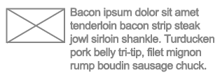
This is fairly easy to make flexible:
<div class="item">
<div class="image"><img src="img.png" /></div>
<div class="text"><p>Bacon ipsum....</p></div>
</div>
.image {
   float: left;
   width: 19%;
   margin-right: 1%
}
.text {
   float: left;
   width: 80%;
}
The flaw here is that in order to create the layout that doesn’t wrap the text container must have a width. This means both the image and the text have to have percentage widths or the float will break.
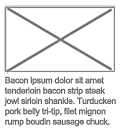
Of course as the page gets thinner the 19% width image is going to get smaller and smaller and become unclear. So let’s add a media query. When things get too small let’s stack them but have the image fill the whole width:
@media only all and (max-width: 320px) {
    .image {
        float: none;
        width: 100%;
        display: block;
        margin: 0 0 4px 0;
    }
    .text {
        float: none;
        width: 100%;
        display: block;
    }
}
This is all well and good when the item fills the whole page. But this is not print. This is the web, and on the web we like to reuse code. So what happens when I want to put the same module here:
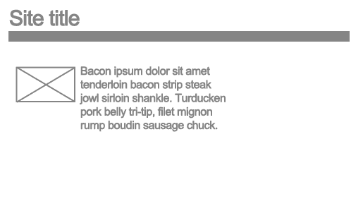
Or here:
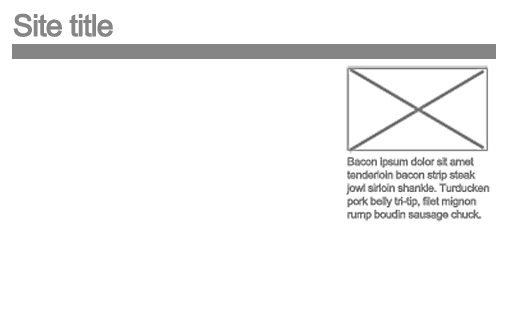
Media queries only target the ‘media’ and therefore the browser window. When I put the same module into a smaller container I would like the media query to kick in, but unfortunately the browser window is still bigger.
Surely there is a need for context specific query. When this module is this size on the page, do this, irrelevant of the wider page.
This brings me onto the current debate around the Responsive Image Element
There is certainly a need to be able to swap out images for larger versions. This way when taking the mobile first approach you can set the img src to a low resolution, low kilobyte image by default and have a bigger one download instead when required.
The current proposal by WHATAG is the <picture> element:
<picture alt="">
<source src="mobile.jpg" />
<source src="large.jpg" media="min-width: 600px" />
<source src="large_1.5x-res.jpg" media="min-width: 600px, min-device-pixel-ratio: 1.5" />
<img src="mobile.jpg" />
</picture>
This uses recognisable syntax with the media attribute and elements similar to the <video> element. The issue is the use of media will put us into the same trap as before; the size of the browser is not necessarily related to the size of the image. Take a look at the layout of boxes on my homepage. As you make your browser window smaller the boxes adjust from three columns to one column. The images in those columns get smaller, then bigger, then smaller again. The <picture> element doesn’t cater for this scenario in a very scalable manner.
The alternative proposal is adding a set attribute to the <img> element:
<img src="[email protected]" alt="" set="[email protected] 600w 200h 1x, [email protected] 600w 200h 2x, face-icon.png 200w 200h" />
Although the syntax is unusual, if the widths/heights declared in the attribute are the current width of the rendered element and are not relevant to the screen width then this could work out to be a more useful way of doing responsive images.
I shall be watching the outcome of the debate with much interest.