UPDATE 17/01/2013: Adding the piece of CSS recommended in this article will break responsive pages on the latest Windows Phone 8 with IE 10.0. It is recommended not to use this “fix” until that bug has been sorted. Follow this thread for more information.
You’re probably well aware of responsive web design; a principle where you no longer build your website to a fixed 960 pixels wide, but allow it to adapt and flex to fit wherever it happens to be.
There is a massive range of screen sizes from phone to smart phone to tablet to desktop and even black and white devices like the Amazon Kindle. Each of these comes with their own set of challenges but it looks like there is a new kid coming up on the block.
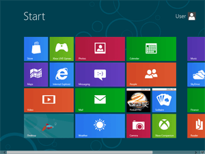
Windows 8 offers a radically new desktop/tablet experience and will support a range of hardware devices. Application developers for windows 8 will need to be aware of scaling for different screens.
Note: At the time of writing Windows 8 is still in Consumer preview so any of this is subject to change before general release.
Internet Explorer 10
In testing Internet Explorer 10 on Windows 8 I noticed that when you snap a site to the side the page was simply zooming out making it unreadable. It was quite a challenge to discover why but it appears that Internet Explorer 10 zooms the page out when the width is less than 1024px. This may also affect portrait orientation but I am unable to confirm at present as I have the preview on my standard laptop.
This effect is irritating for those who spent a fair bit of time and effort working on their responsively designed pages. You can see the effect on this demo page. A picture of what happens is shown below:
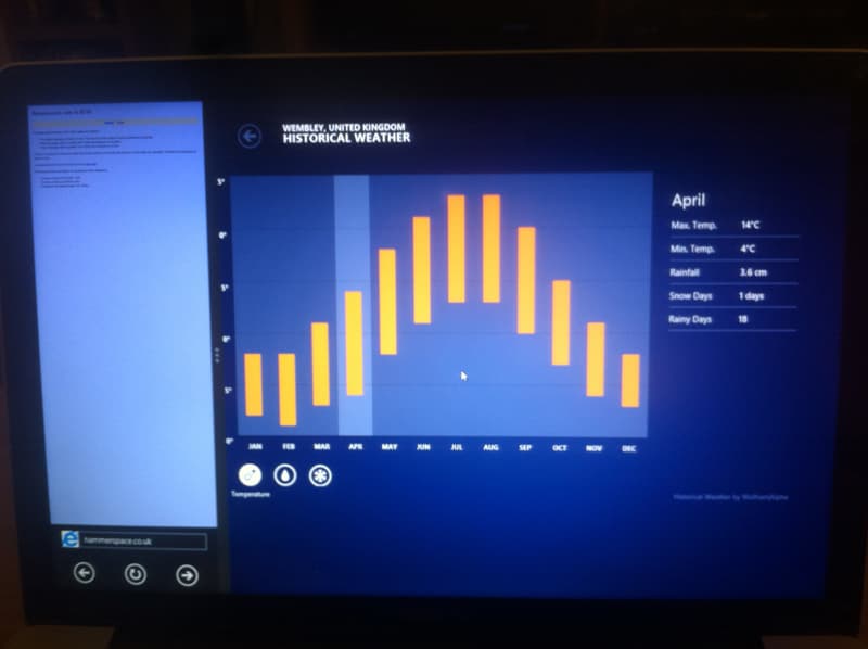
Excuse the photograph; I couldn’t get a screenshot in Windows 8 + Mac keyboard.
The site on the left is zoomed out and unusable.
Solution
As I discovered buried in the device adaptation page there is a simple solution that tells Internet Explorer 10 to disable its automatic scaling and adhere to your responsive designs. Simply add the following to your CSS file:
@-ms-viewport { width: device-width; }
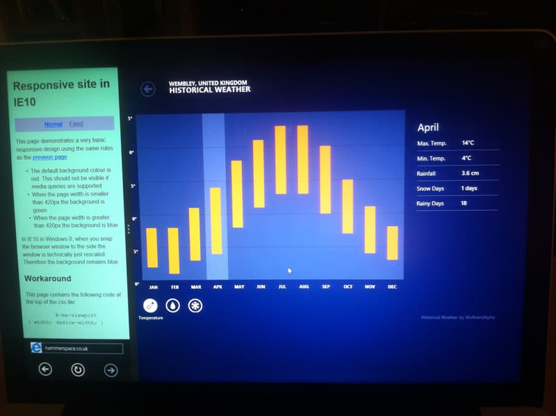
You can see this in action in the second demo page. The change has produced the desired effect in a snapped window (on the left):
Update: necolas makes a good point that it is not optimal to have to do this and it should be considered an IE10 bug. Further discussion here